0
2
/11
Before the start of the design process, some basic strategic requirements were defined. These included the target audiences to be addressed by the new brand and a description of how various Silverell employees envision the new brand to feel.
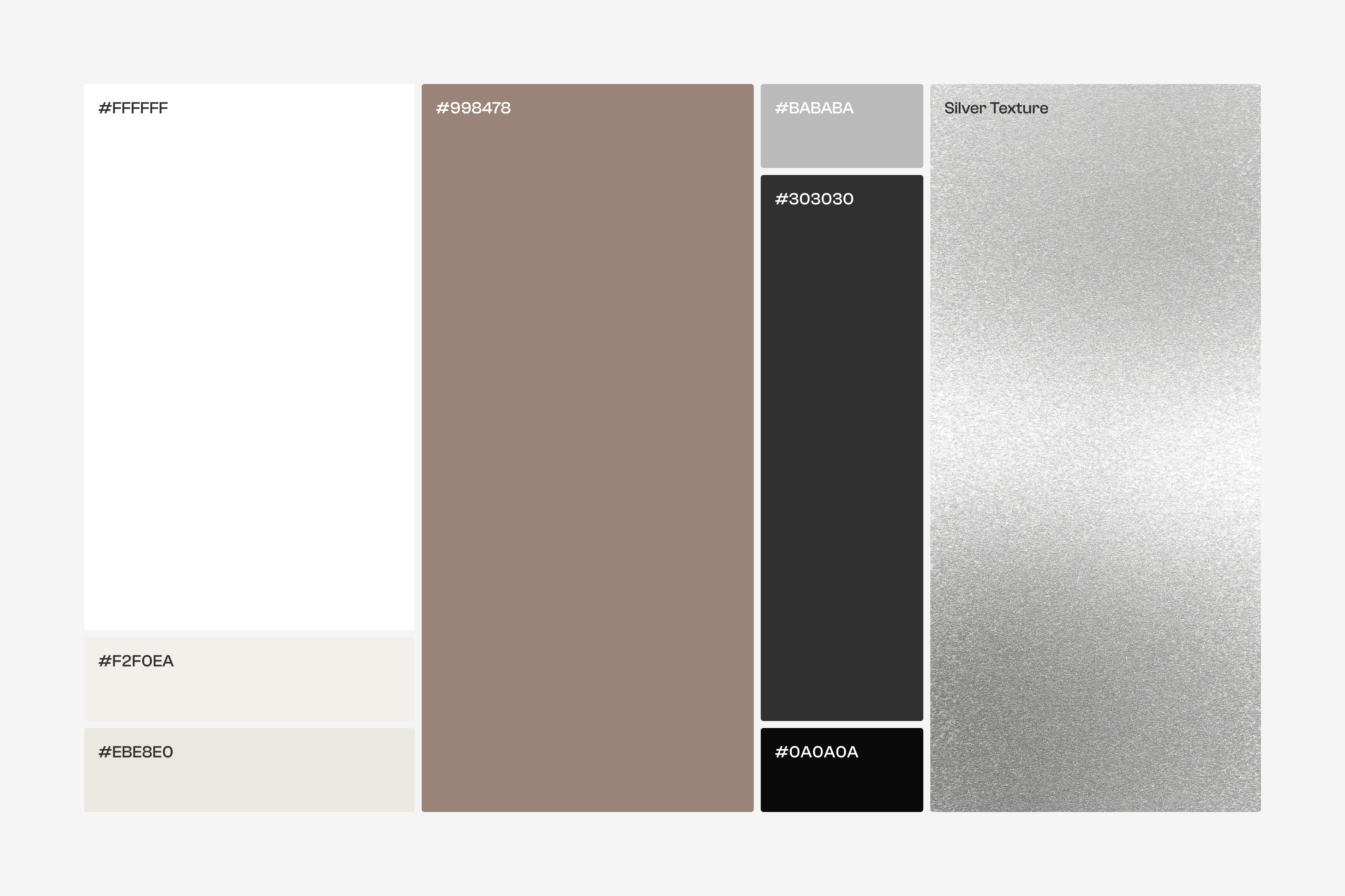
The brand's new visual identity translates these brand characteristics precisely from theory into practice. The new picture-mark focuses on the silver fiber as the brand's USP. The font pairing creates an exciting contrast of technical and soft lettering. The gentle natural colors provide the brand with warmth and approachability. A modern image style with hard shadows highlights the shine of the silver fibers in the product and also emulates natural sunlight.
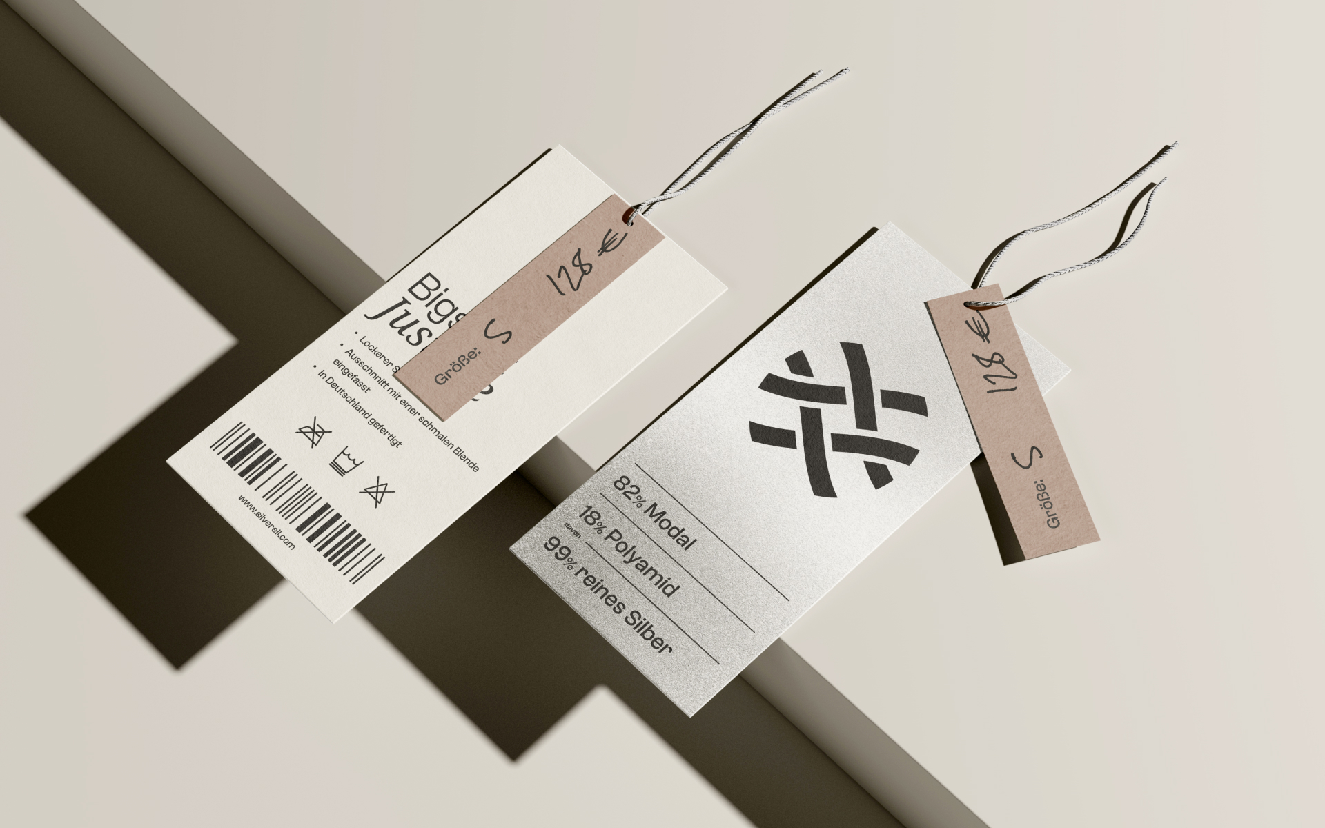
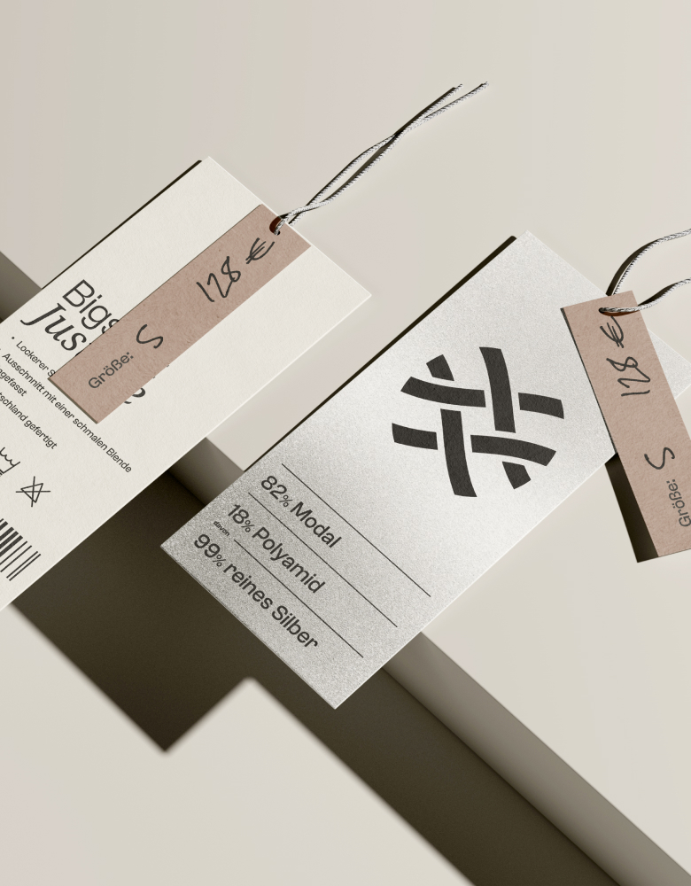
The smallest component of the logo is a slightly curved line. It symbolizes the "S" of Silverell
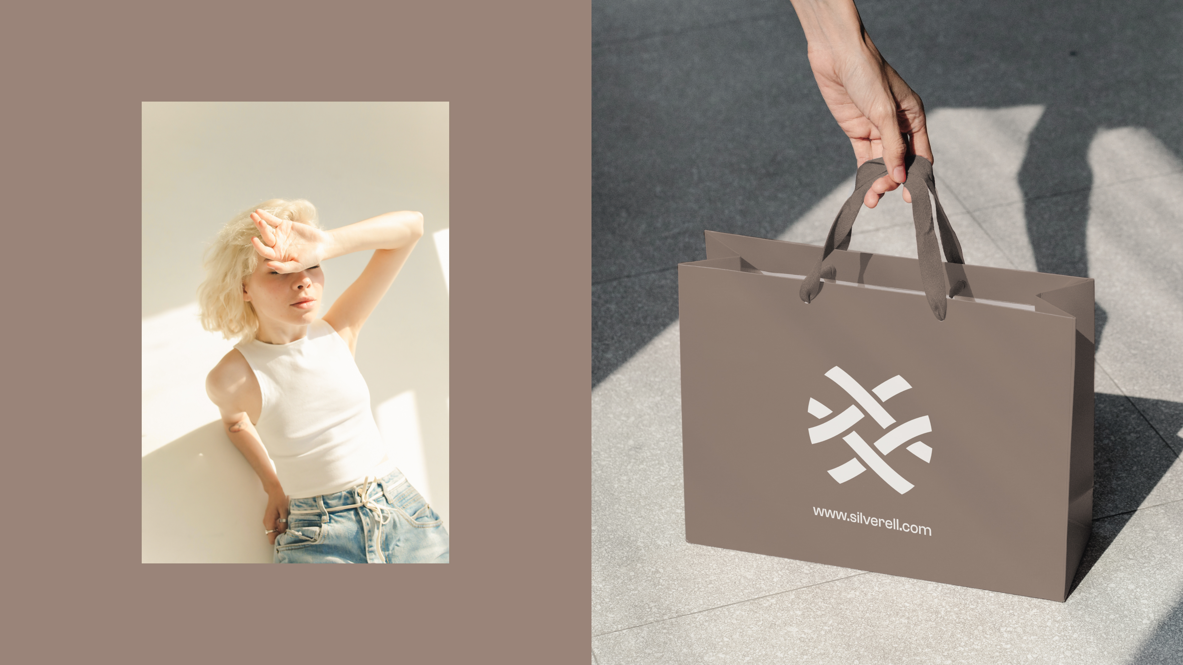
When these lines cross, the result is an "X", which subconsciously stands for the parent company "Shieldex".
The complete picture mark represents a woven textile. This mesh protects the wearer and represents Silverell's unique selling point - the silver contained in the fibers.
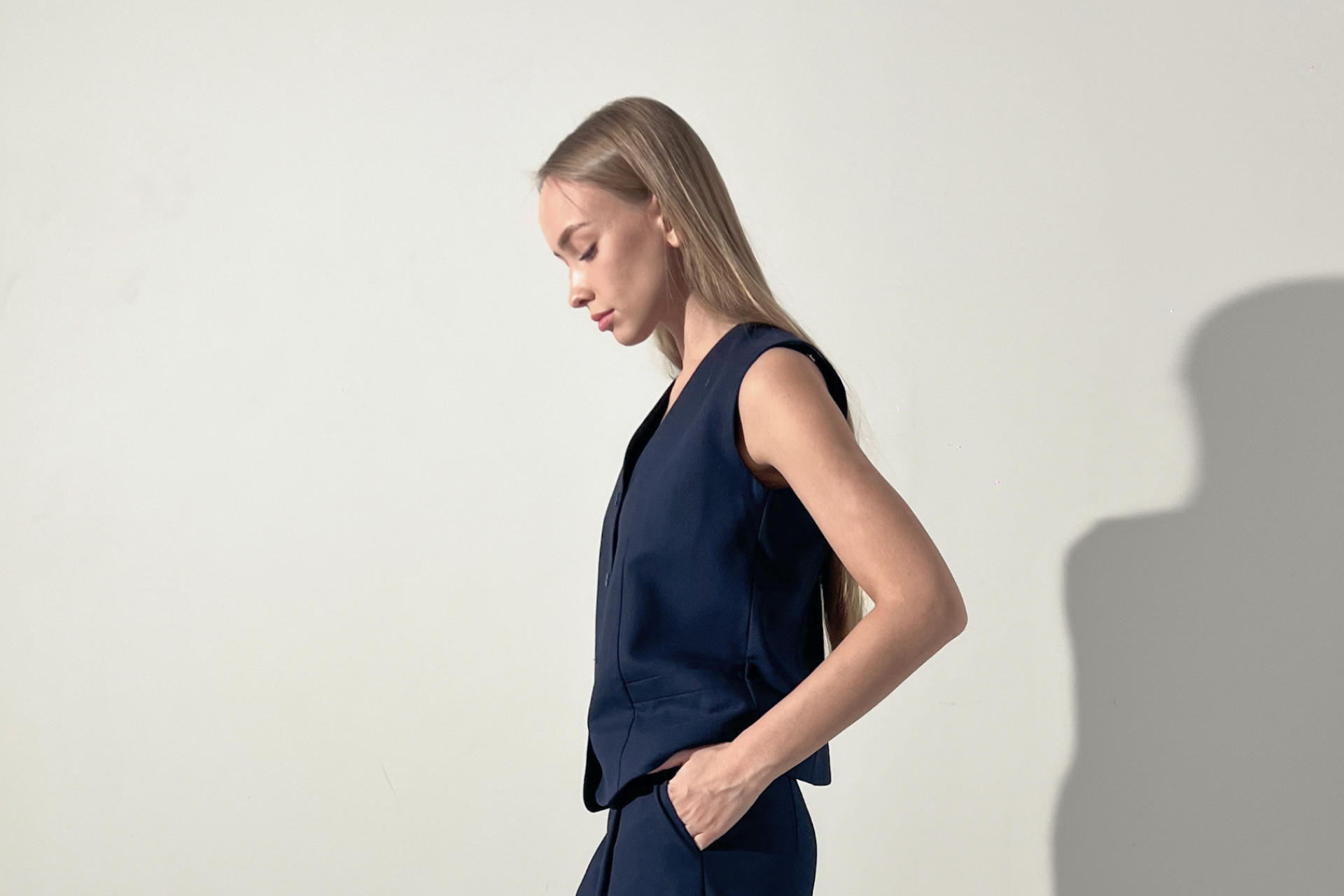
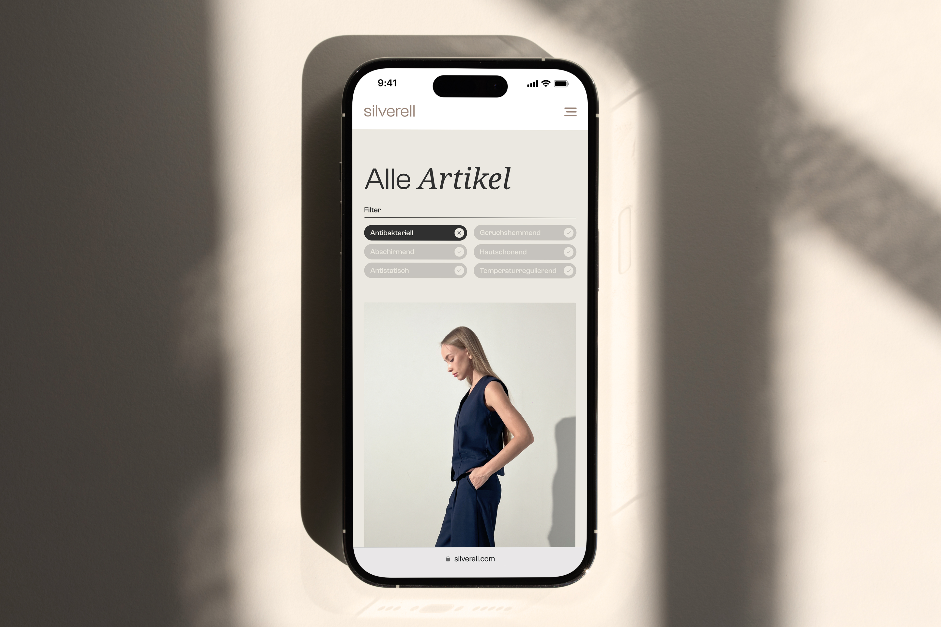
The photography style is defined by a warm color temperature, intended to give the viewer a feeling of security, warmth and cosiness.
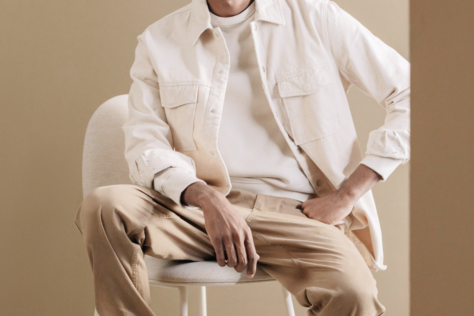
A neutral image background helps to put the focus on the garments.
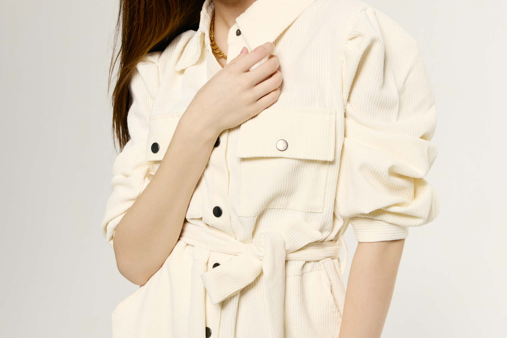
The poses of the models are slightly more casual to additionally pick up on the brand characteristics of warmth, relaxedness and security.
These predefined components of the brand have now been brought together in the design of the website, banner ads, as well as analog touchpoints of the brand, such as packaging and labels. Compared to the old brand, this results in a much more empathetic look and feel that Silverell can use to target a wide range of customers.