0
1
/11




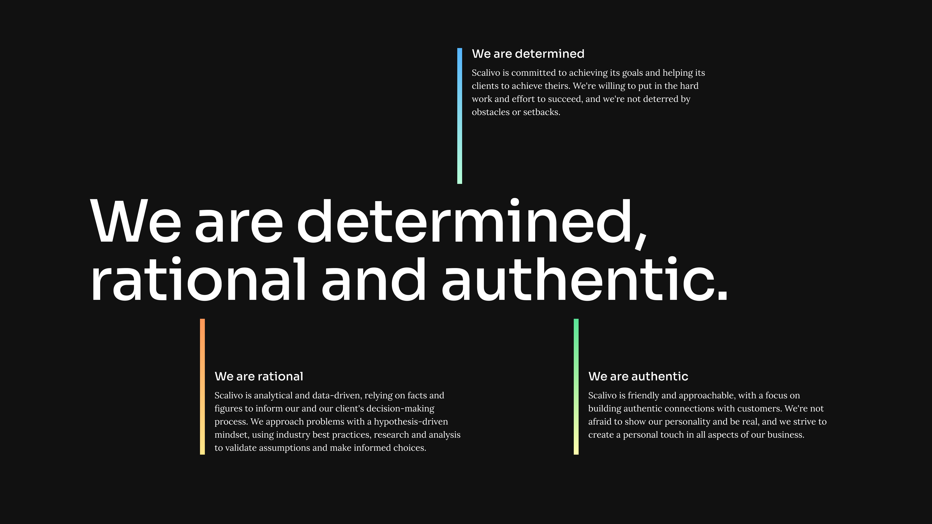
The rebranding process at Scalivo began with a strategy workshop in which the core statement of the brand was clarified. In addition, further strategy points, such as the brand vision, the brand positioning and the values of the brand were developed.
Based on the brand name of Scalivo, the main idea of the new brand design is based on scaling. The scaling logic was picked up by two visualizations of this: 1. the gradual multiplication of a base unit (used also in the logo) and 2. the color gradient from light to solid color.
Abstract scaling through multiplying a unit by 2
Abstract scaling through gradients reaching from light to solid colors
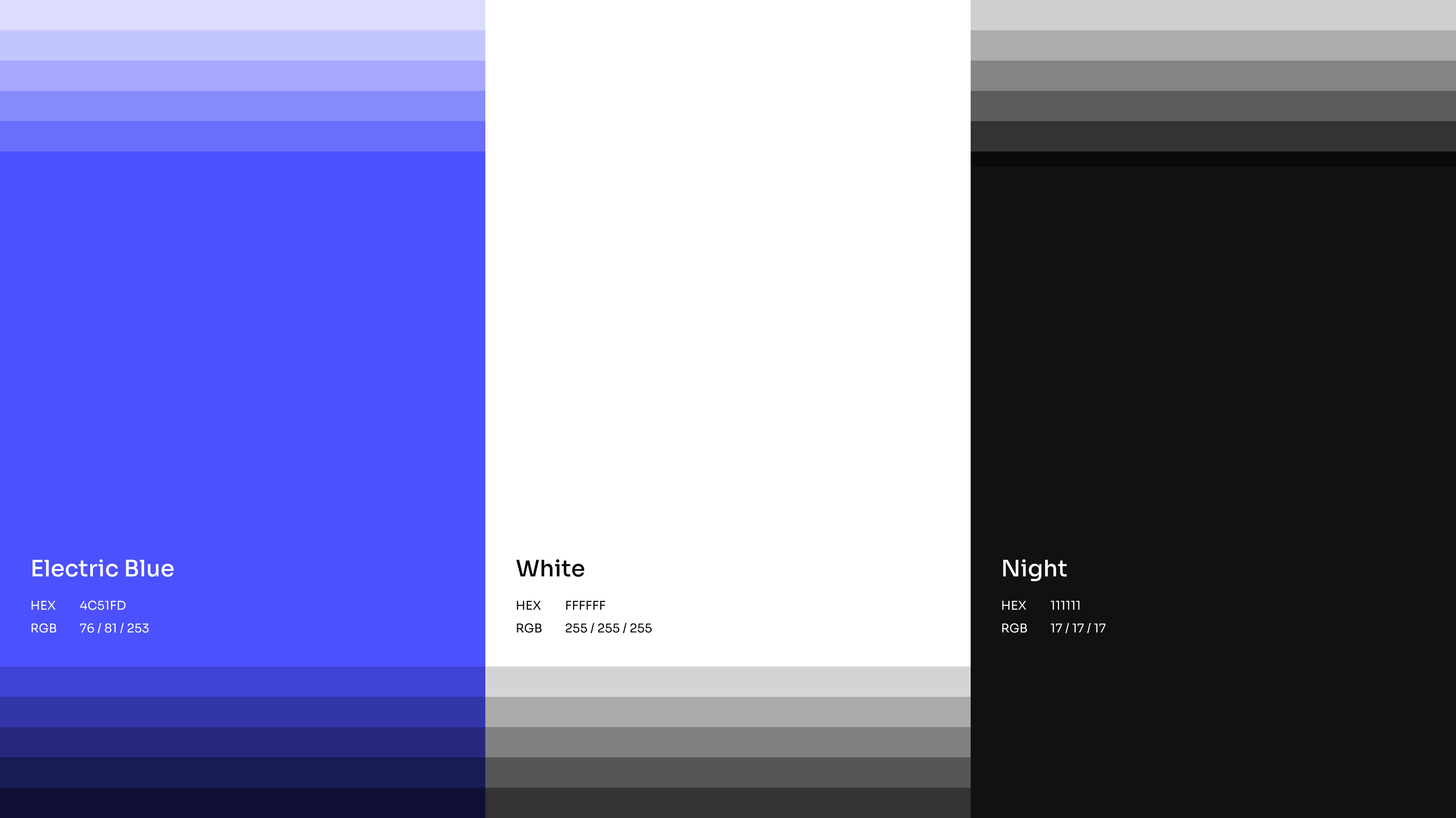
Colors are another important element of the new brand design. An active blue complements the neutral primary colors of black and white. In addition, the use of color gradients makes all its difference: they give the brand a positive, slightly playful touch.
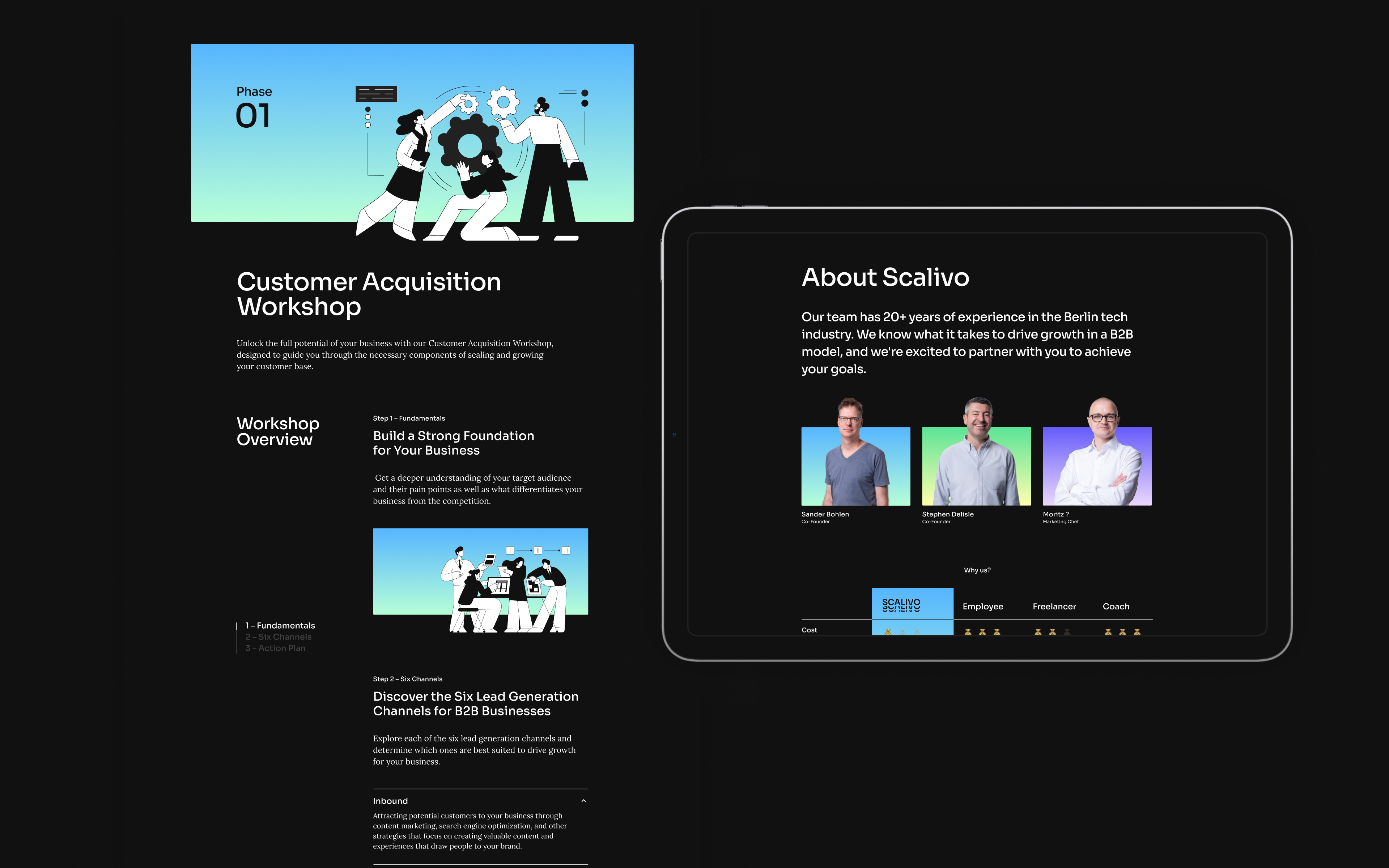
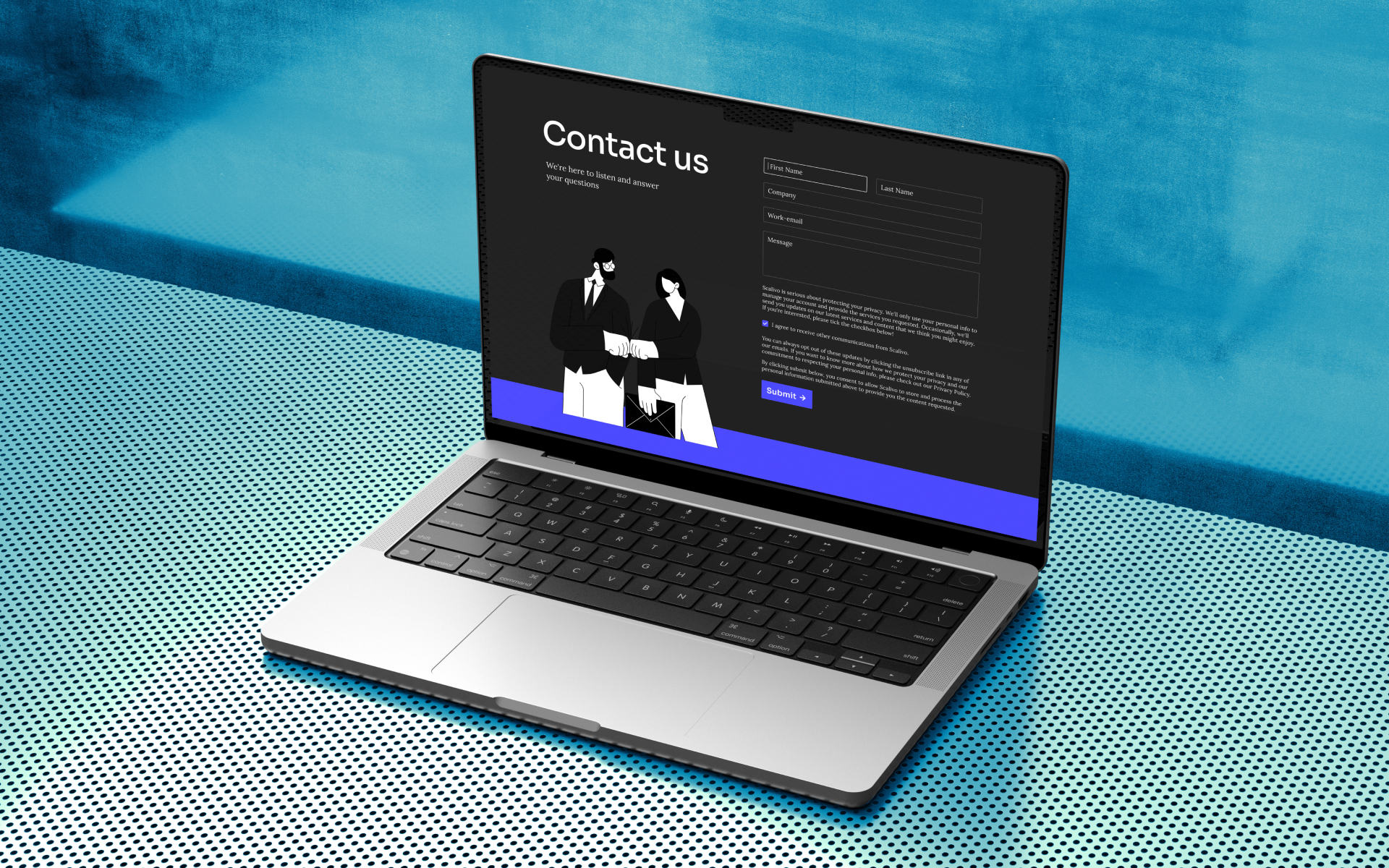
Besides the development of the new corporate design, the reworking of the existing website has also been one of our main tasks. The website aims to explain the process of working with Scalivo in a structured way and to highlight the different products that Scalivo offers. The content is presented through clear typography and visualized with fitting illustrations.


Another part of the deliverables was developing templates that the client can use directly to develop layouts for LinkedIn and other social media channels. In addition to these, other applications were designed in the rebranding process to visually describe the look and feel of the brand.
